UX Redesign: Better UK
Product Overview:
The Better UK app is a mobile application for users to book activities and buy memberships for Better UK gyms across the country.
As a user of this app, I discovered a problem regarding the user interface when first understanding what features were available and where I could find them.

Problem
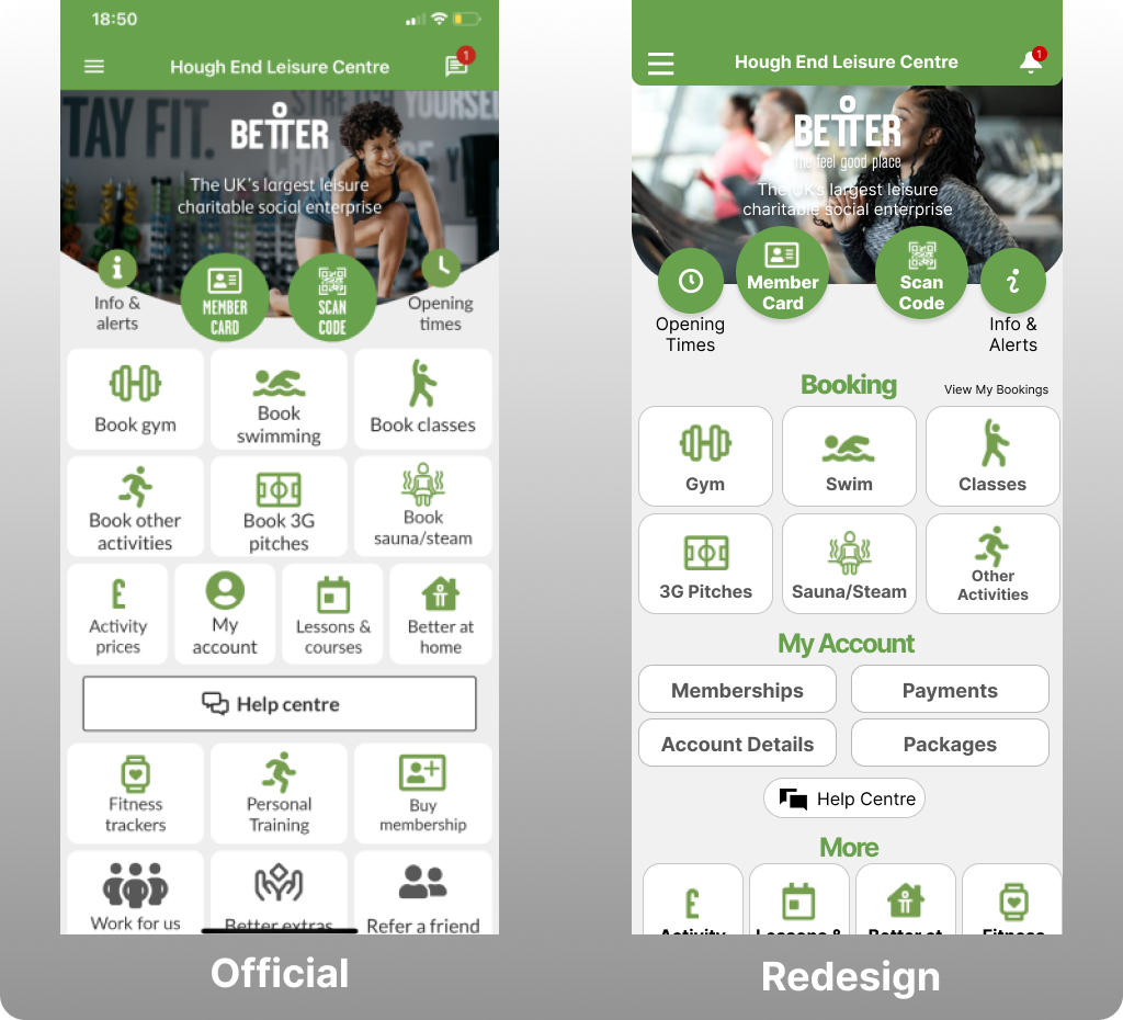
In the original design, all the options are homogenised in a grid format and feels too cramped.
While the booking options are placed higher on the page and ever so slightly larger, the term “Book” is being repeated often and aren't distinguished well enough from the other grid icons which could be an accessibility issue for those with visual impairments and more.
Solution
I intend to improve the general user experience of the home page by reducing any clutter to simplify the interface.
By sectioning the major options for the user, it should improve the efficiency of access and bring a higher level feeling of openness.
I also wanted to bring a modern approach to the UI design inspired by recent industry trends.
Tools & Programs Used
Goals
Wireframes

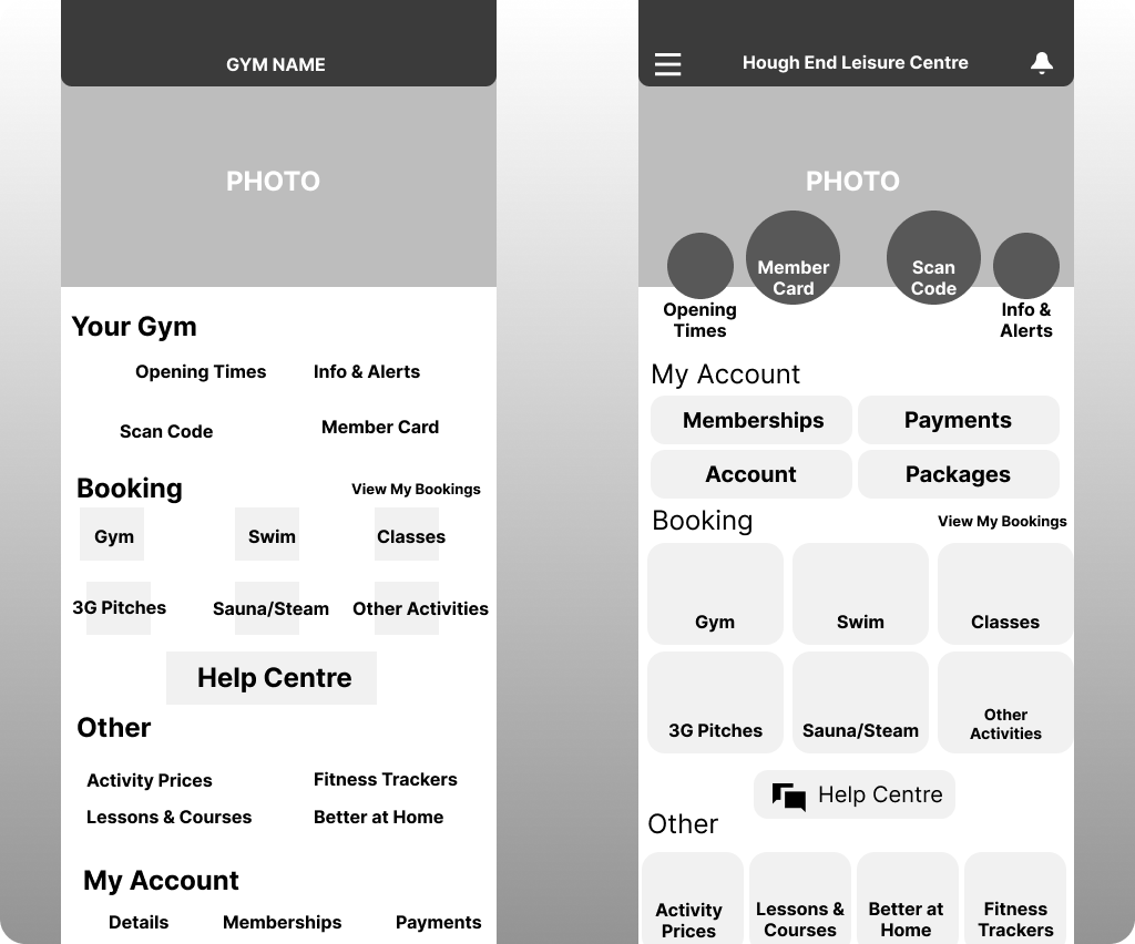
For my initial concept, I designed a quick wireframe to understand where I wanted the options to be placed to improve the user's understanding of the app while keeping the original visual language.
I wanted to segment the different features more clearly and chose to make a new section called "Your Gym" to align with the new layout.
After developing a more refined wireframe, I revised many of the sections and design changes.
Firstly, I removed the "Your Gym" heading as it was deemed unnecessary on further reflection and the app's original bubble layout was a more dynamic way to stand out.
To better distinguish each section, I made sure to keep them uniform-yet-distinct with different shapes and sizes for the user to quickly understand how each was separate.
Final Design
With the final design, I decided to rearrange the order of the "Booking" and "My Account" sections as after revaluation, I realised users would come to the app requiring access to their Booking options on a more regular basis.
I also centered the headings and renamed the "Other" section to "More" to have users quickly see the heading and to have a better understanding of the additional options.